
Reflections on Craft, Wood and Grit
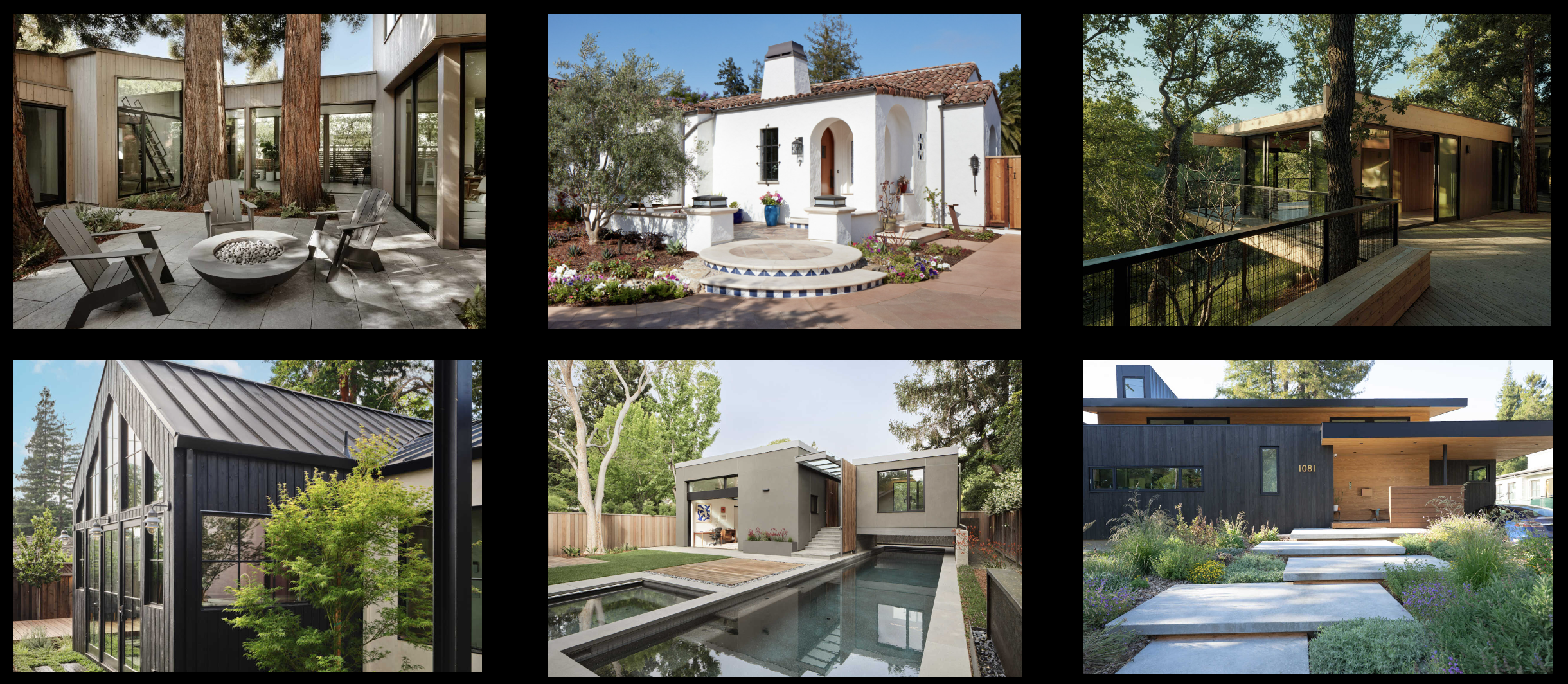
AIA Silicon Valley Homes 2026. Image Credit AIA
The AIA Silicon Valley Home Tour this past Saturday was nothing short of a sanctuary for the design-weary soul. Six homes spanning Palo Alto, Los Altos, and Monte Sereno, each offering its own conversation between earth, structure, and human living.
As designers, we often forget how understated the quiet art of architecture is to the outside world. We get bogged down in code, site limits, and budget sheets, losing sight of the magic that happens when a vision actually breaks ground. Stepping into these homes—talking with the builders, contractors, and architects—reminded me of the sheer grit, artistry, and courage required to turn a sketch into a sanctuary.
Due to strict tour policies, I was unable to photograph many of the beautiful details that could have served as my own inspiration. Yet, I deeply respect that there is a beauty in the mystery and a privilege in preserving the privacy of fine art; as such, I have relied on the official photos from the architects' portfolios to capture these moments.
Three homes, in particular, left a lasting imprint on me.
1• 8 Tree 8 • Ana WilLIAMSON ARCHITECt
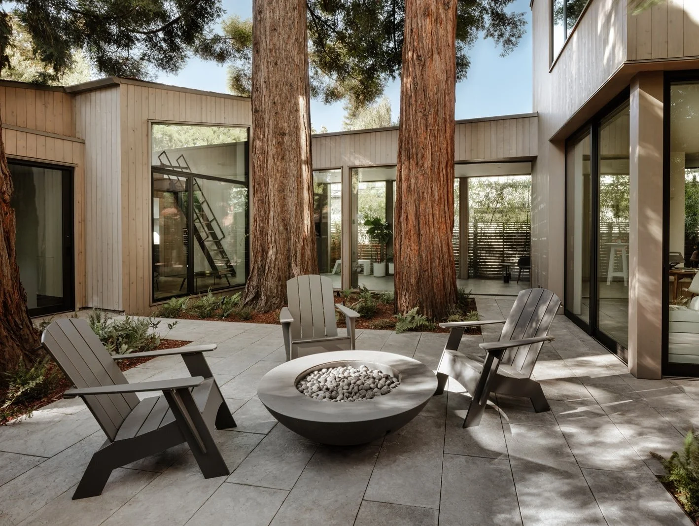
The Courtyard. Image Credit: Ana Williamson Architect
Just blocks from busy downtown Palo Alto on a narrow urban infill site, a cluster of mature coast redwoods towers over the land. It was here that Ana designed a single-family home for a busy professional couple who fell in love with the site, drawing heavy inspiration from the site-forward, organic aesthetic of Northern California's iconic Sea Ranch community. Instead of imposing a box on the land, individual program blocks stack, twist, and turn through the redwoods—preserving nearly every tree to create a fluid play of sunlight, shade, passage, and rest.
Ana’s design immediately transported me back to my university days, reviving that fundamental design ethos: you work with the land, you do not dominate it. In a region where property owners too often view mature trees as obstacles to be cleared, Ana chose to weave her architecture seamlessly around 10 to 12 giant redwoods.
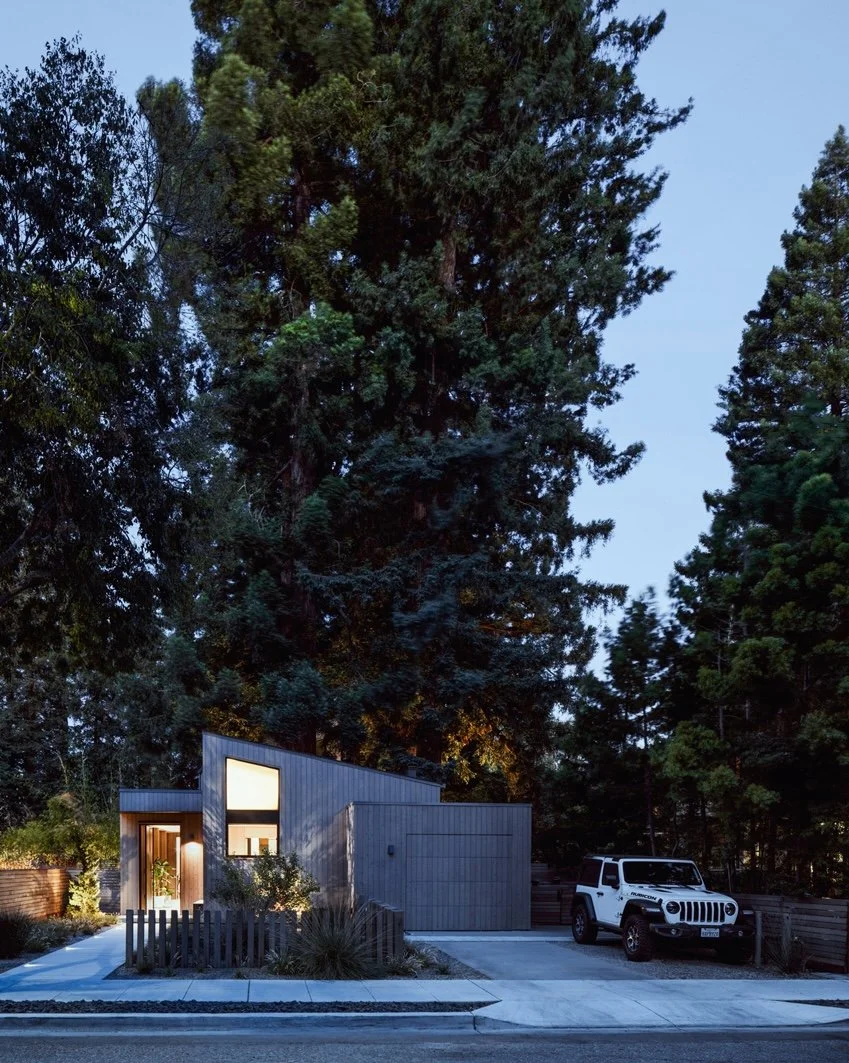
Curb View. Image Credit: Ana Williamson Architect
The approach from the curb gives nothing away. You expect a conventional residential layout, but instead, you step into a light-filled entry hallway framed by glass on both sides. To the right sits a clever, detached ADU complete with a mezzanine and a custom wooden ladder that glides along matching paneling. Looking straight through the hall, your eyes are drawn across a central courtyard anchored by the majestic redwoods and open decking.
Every detail in the main residence felt intentional and deeply personal:
The Interiors: Minimalist, warm cabinetry in the kitchen, a stunning live-edge dining table, and built-in bench seating designed for young tech clients who embraced a non-traditional layout.
The Staircase: A dog-leg stair with a delicate, perforated metal railing leads to a landing that forces a deliberate, poetic pause—punctuated by a massive picture window looking straight into the canopy.
The Fenestration: The windows throughout act less like openings and more like carefully proportioned picture frames, capturing snippets of the natural world outside.
Standing in the backyard, resting my feet on the grass, I looked up to see the whitewashed wooden siding echoing the vertical rhythm of the bark. The home didn't just sit among the redwoods; it felt locked in a gentle, living embrace with them. Spoke with the builder, Peter, who walked me through the execution of their floating baseboards and complex foundation details—a masterclass in technical precision serving organic form.
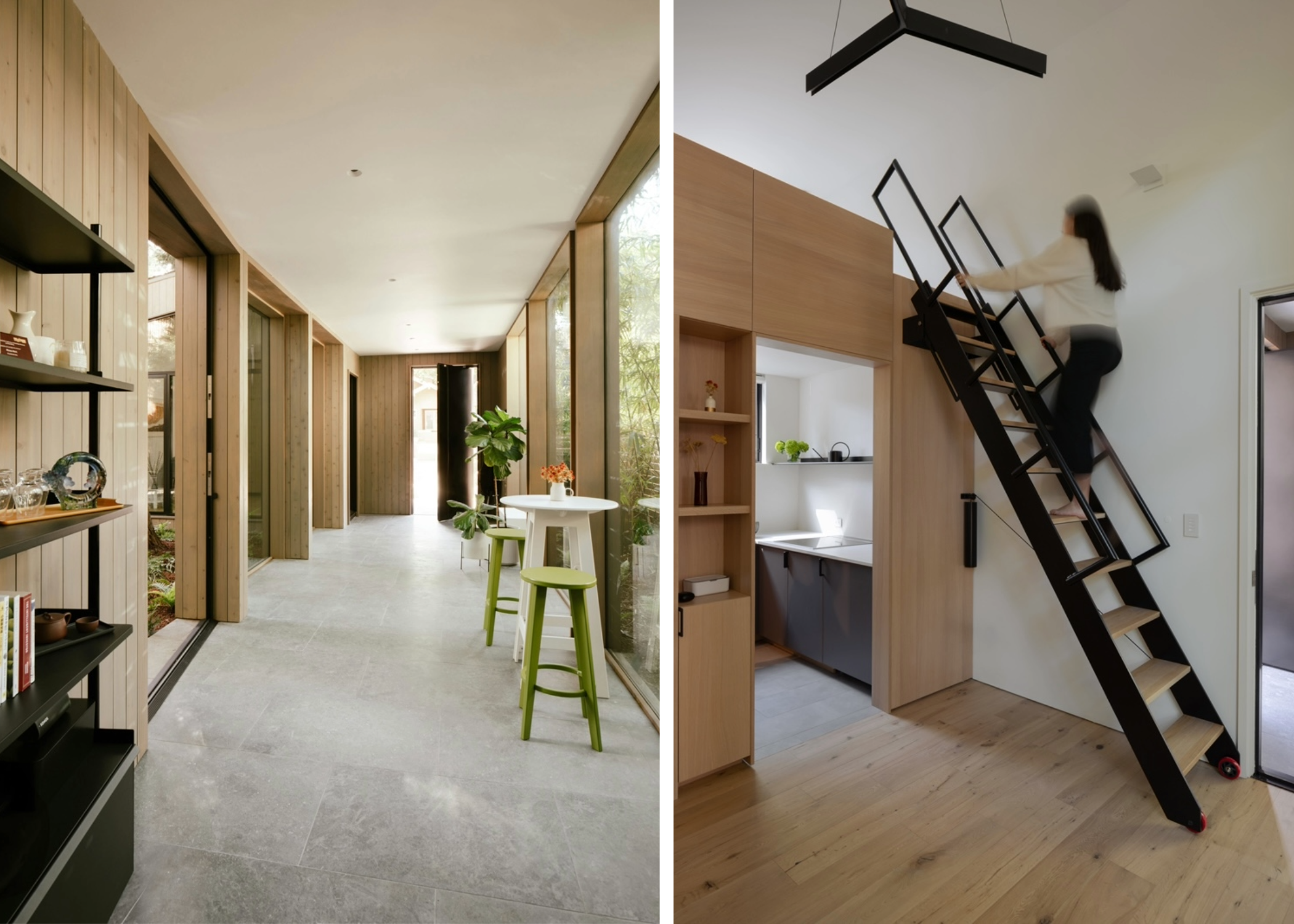
The Entry and the ADU. Image Credit: Ana Williamson Architect
2• Seven Arches • KNR Design Studio
I’ll admit: reading “New-Build Mediterranean Spanish Style” in the tour brochure made me a bit skeptical at first. In Northern California, that descriptor can easily slide into heavy, predictable territory. But sticking to my route proved to be a masterclass in pleasant surprises.

The Backyard. Image Credit : KNR Design
Kendra’s project is a 2,300-square-foot single-story Mediterranean Revival home, complete with a 1,500-square-foot basement, a detached ADU/garage casita, and a complementary landscape with a floating "walk-across" pool path. Built for two architects, the home pays deep homage to the original 1920s structure that once stood on the site—even salvaging and re-installing its original terra cotta roof tiles.
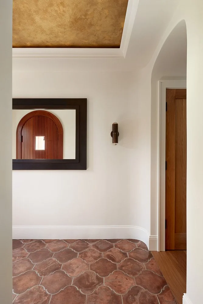
The Entry. Image Credit : KNR Design
From the moment you enter the foyer a deep, pervasive sense of calm settles over you. At the entryway, a champagne gold ceiling in combination with the terra cotta tiles gives you luxury and simplicity in one frame. Every nook and cranny was crafted with intense devotion: radius-curved arches, Venetian plaster fireplaces, a secret bookcase door in the primary suite, and a bar area with a massive true arch and an oversized steel window. Bi-folding steel doors glide open to connect the indoor living area effortlessly to the patio, pool, and firepit beyond. The material palette—warm woods, tactile stone, heavy slabs, and quiet tile work—held the entire home together in effortless harmony.
Behind that tranquility, however, lay serious structural grit. In chatting with Kendra, I learned about the massive 36-inch deep glulam beam supporting the roof ceiling, giving the roof nearly a foot of depth. She recounted putting up a complex gabled wall by the kitchen sink in the middle of a torrential downpour—a reminder that beauty in our field is almost always hard-won.
It takes clients who trust a vision that surpasses what standard floor plans (or even modern AI renderings) can capture. This project was truly a labor of love. I left her project with an itch to study her details further, fully inspired to embrace and experiment with that level of refined, traditional warmth in my own work.
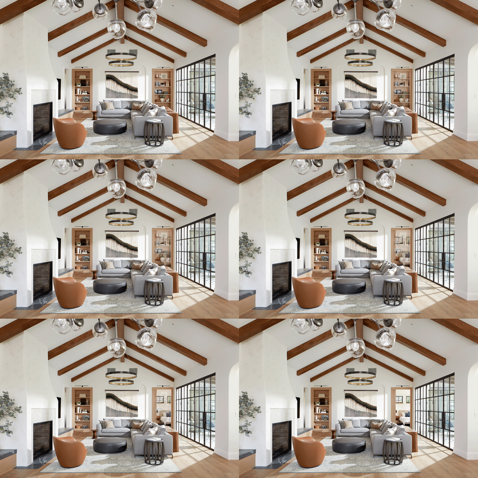
The Family Room. Image Credit : KNR Design
3•Pavilion in the Oaks • Mork-Ulnes Architects
My final note belongs to a captivating wellness and entertainment pavilion nestled into a steep, tree-covered hillside in Monte Sereno. Commissioned as a flexible space —as well as hosting extended family gatherings—this addition connects to an existing 1970s stucco ranch home via a sleek glass bridge. Raised above the sloping terrain on slender steel columns to match the basement walk-out level, the pavilion forms a three-sided summer courtyard around existing redwood and oak trees that puncture the new decking.
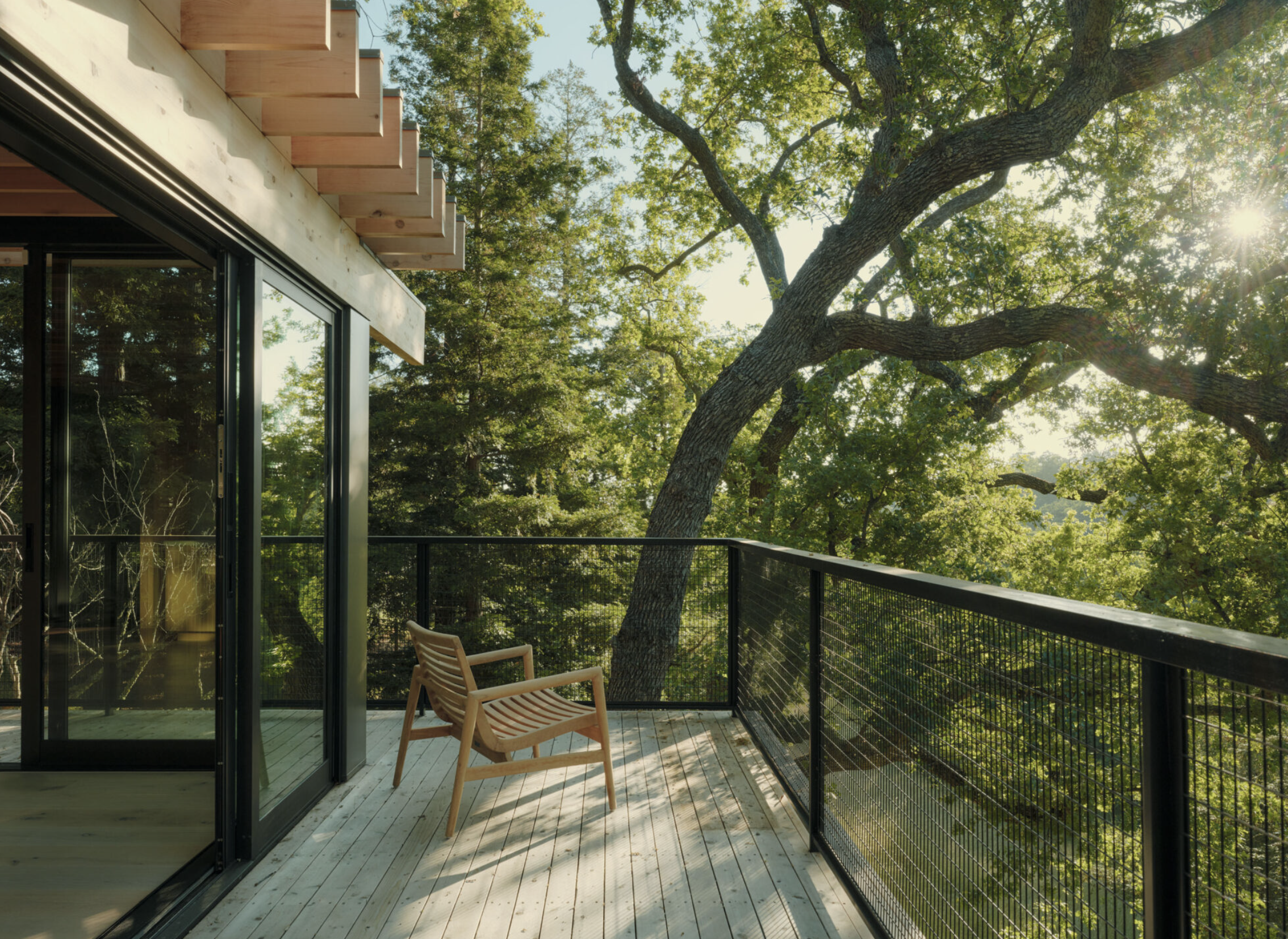
The Entry. Image Credit : Mork-Ulnes Architects
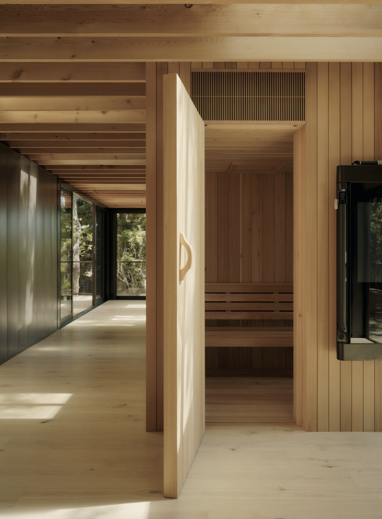
The Sauna. Image Credit : Mork-Ulnes Architects
Inside, the space is organized around a central cedar core containing a fitness room, sauna, and bathroom. Above, exposed cedar roof framing filters natural light through skylights, bringing the experience of sitting beneath the forest canopy right into the room.
Standing in bold contrast to the main home, this cedar box wrapped in steel cladding sang aloud with its Scandinavian heritage. One of its standout architectural features was a two-and-a-half-inch-thick blind door, completely clad in vertical cedar slats inside and out, pivoting seamlessly at the top and bottom.
Looking up at the roofline from the deck, I noticed a curious detail: one of the Glulam cedar beams extended significantly further than the rest, reaching out into the tree canopy without any clear structural need. When I asked Robert about it, he smiled and explained it was a pure compositional play. Originally intended to reach even further, it was trimmed back mid-build to honor the existing tree canopy.
Robert and the team had originally envisioned the ADU as an open-air pavilion—where the exterior decking flowed straight through the interior beneath open skylights, leaving the space exposed to the elements. While the clients ultimately opted for a fully conditioned living space complete with a home gym, a plush lounge that raw, elemental DNA still vibrates through every piece of cedar millwork.
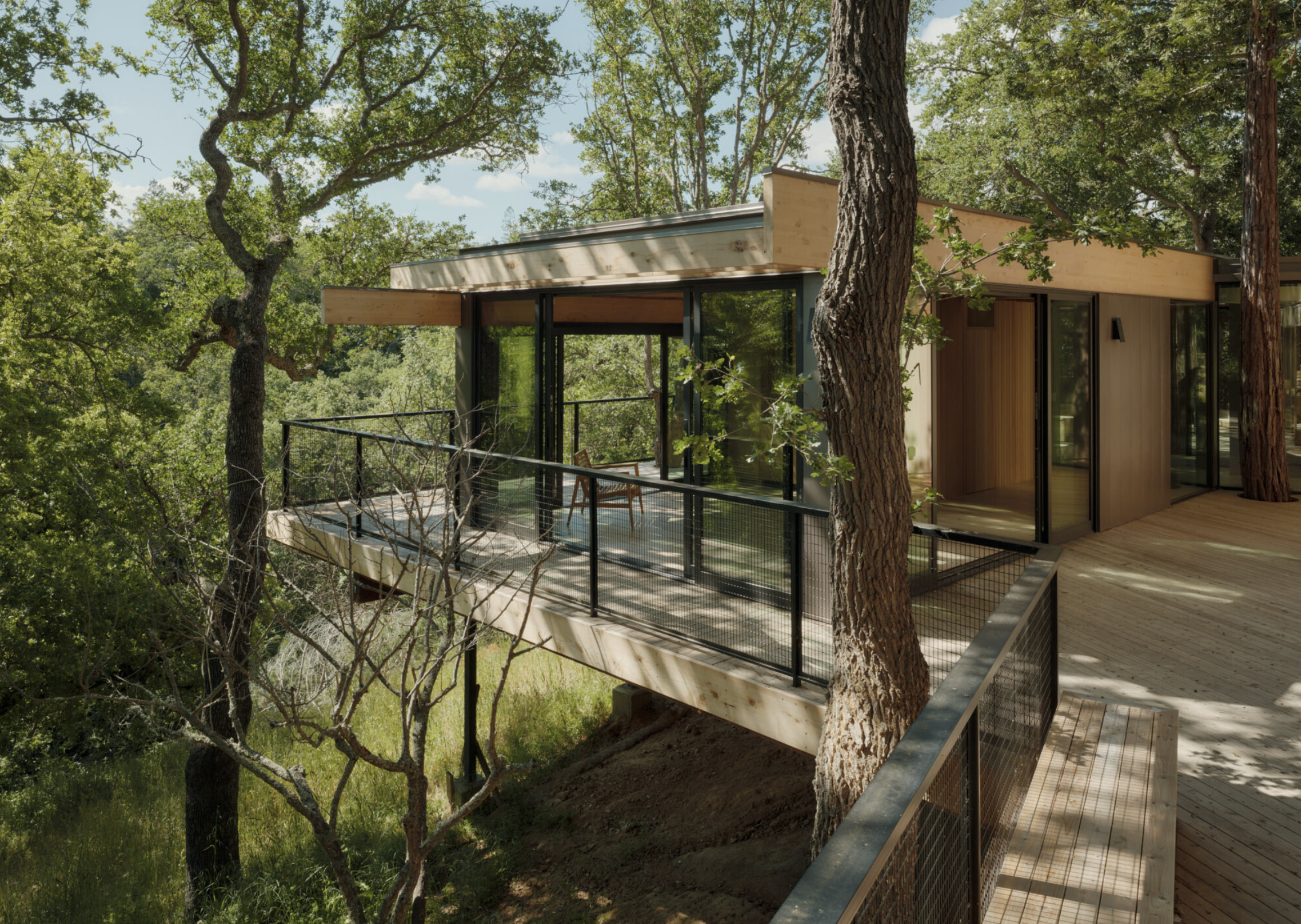
The ADU. Image Credit : Mork-Ulnes Architects
Final Reflections
Driving home, I couldn't help but reflect on how differently each architect approached a single material: wood.
Ana treated wood with a quiet, whitewashed elegance that mirrored the surrounding forest.
Kendra used deep, rich wood tones to anchor interior spaces with timeless warmth.
Casper and Robert wielded wood boldly and unapologetically, letting it wrap inside and out as both structure and skin.
It was a Saturday spent away from home, but it repaid me tenfold in visual fuel and mental clarity. A heartfelt tip of the hat to the architects, builders, and trusting clients who make spaces like these possible.
Back to the drafting board with fresh eyes!
